Data template
KPI Dashboard
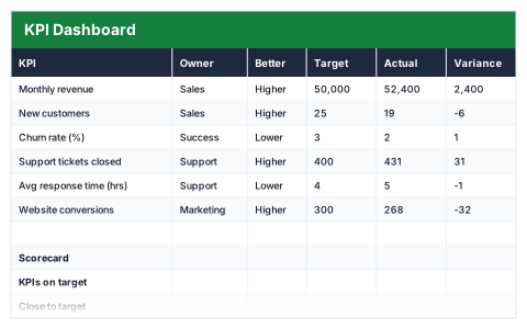
Target against actual with on/off-target status, direction-aware so lower can be better.
- Live formulas
- 23
- Columns
- 8
- File
- 8 KB
$5
Checkout opening soonOr get it with all 66 paid templates in the complete pack — $45.
Works in Excel 2013 and later, Microsoft 365, Google Sheets and LibreOffice Calc. Set up to print on one page wide.
About this KPI Dashboard template
A KPI dashboard should show in seconds what is on track and what is not. This Excel template lists each KPI with an owner, target and actual, works out the variance and percentage of target, and gives each a status.
Every KPI is set to 'higher is better' or 'lower is better', so measures like response time and churn are judged the right way round. The scorecard counts KPIs on target, close to target and off target, and names the worst performer.
Good for
- →Monthly management reporting
- →Team meetings reviewing performance
- →Tracking a small set of business goals
What it works out for you
Scorecard
- →KPIs on target
- →Close to target
- →Off target
- →Average attainment
- →Worst performer
What you fill in
The table has 8 columns. Calculated columns fill themselves in; the rest are yours to type over.
- →KPI
- →Owner
- →Better
- →Target
- →Actual
- →Variance
- →% of target
- →Status
How to use it
Set whether higher or lower is better per KPI — response time and churn should not be judged the same way as revenue.
The file opens with sample rows so you can see every formula working before you change anything. Type your own figures over them. When you need more rows, insert them inside the existing block rather than underneath it, so the totals keep covering every row.
Functions it uses
Every one of these exists in Excel, Google Sheets and LibreOffice, so the file behaves the same wherever you open it.
AVERAGECOUNTIFIFIFERRORINDEXMATCHMINQuestions about the KPI Dashboard
Why does each KPI need a 'Better' setting?
For revenue, higher is good; for costs or response time, lower is good. The setting stops a KPI being marked as a success when it has actually moved the wrong way.
How many KPIs should I track?
As few as give you a clear picture. A handful of well-chosen KPIs is more useful than dozens nobody reads.
Does it draw charts?
No. It is a scorecard table with colour-coded status. You can add Excel charts on top of the target and actual columns.